My choice for the cover of “Arte Contemporanea in Indonesia”

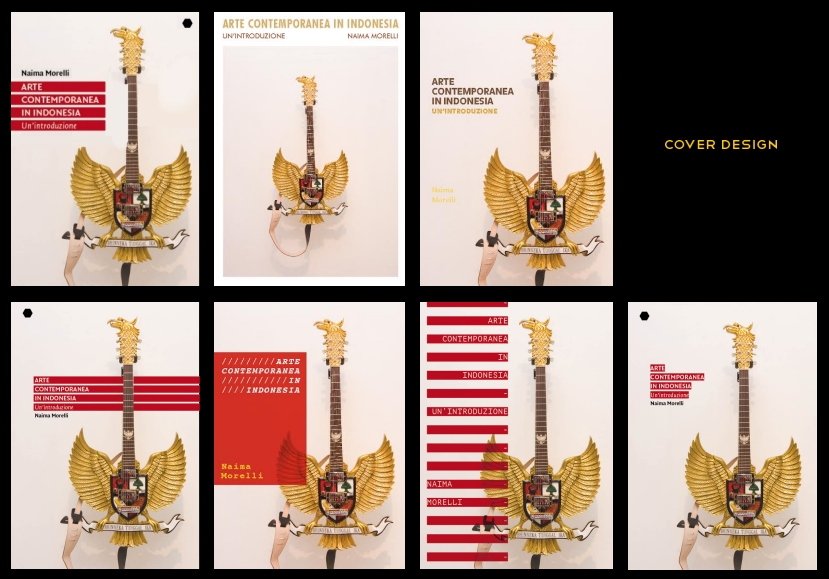
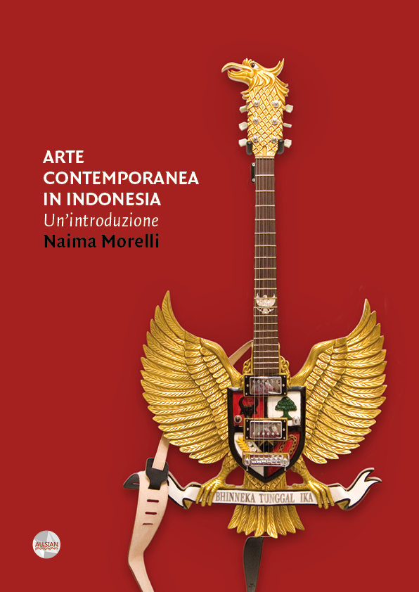
They say you don’t have to judge a book by its cover but, as people working in the arts, we all know how powerful an image can be. Ever since I had seen this artwork entitled “Masihkah Garudaku ber’Nada’ Pancasila dan Bhinneka Tunggal Ika…??” at ART/JOG12, I knew it was the perfect image for my book. I jotted the name of the artist who made it on my notebook: Karyadi. It was not easy to find his contact, but thanks to Aditya Chandra and Abdul Fattah I finally got his email address. Karyadi was super-nice and he allowed me to use a photo of his work for the book cover.
I worked together with graphic designer Lucas Leo Catalano for a beautiful and striking cover. As you can see we tried many different solutions – there are actually many more than the proofs above. Some of them were interesting, but I couldn’t get rid of the feeling that something was missing. What I did then was to open my Photoshop and experiment a little by myself. After an hour I got it. Of course! Why didn’t I think of that before? I called Lucas who was waiting for me to decide: “Bub, I made up my mind of the cover! It must be red!”

You can pre-order the book by sending an email at contact[at]naimamorelli.com with the subject line “Indonesia Book” – more updates here


This is cool. Red is cool.
It’s imtviapree that more people make this exact point.